[content-section top=”100″ bottom=”188″]
The Complete Guide to Popups for Dental Businesses
The classic website popups. You’ve likely come across a few thousand in your lifetime.
Website popups have been used by marketers and webmasters alike for years to engage with their incoming website visitors. I like to think of a website popup like a store greeter that welcomes a new visitor with a friendly hello and any need-to-know information.
Most importantly, a website popup is meant to push a visitor to take action. Whether that be to claim a discount, enter their email, or finish their transaction. In fact, installing a simple email opt-in entry popup can increase email sign-ups by 1375%.
Website popups are made to grab attention and push your visitors to make a decision. Accept the offer or refuse, either way your visitor will need to make a conscious decision.
Now compare that to an email opt-in box sitting in the sidebar or footer. Without any action prompts a visitor is more than likely to just ignore it and make no decision at all. Say goodbye to your hopes of building a large email list…
In this article I’ll give you an overview of website popups and why you should incorporate them into your dental business’ website.
Popup Best Practices
First we’ll go over the types of website popups. There are 5 different types of website popups, each with their own purpose and function:
- Entry. Displays immediately when a visitor arrives. Entry popups are best for collecting emails, promoting discounts, navigating to areas of interest, and much more.
- Exit. Displays when a visitor moves to leave your website. Exit popups are best for capturing information from visitors about to leave or encouraging shoppers to finish their transaction.
- Click. Displays when a visitor clicks a specific button or area. Click popups are best used to avoid sending visitors to a separate page. Instead a form can display right after a button click.
- Timed. Displays after a set amount of time after a visitor arrives. Timed popups are best for allowing visitors to explore a bit before making your pitch.
- Scroll. Displays after a specific portion of the page is scrolled through. Scroll popups are best for making sure a set amount of the page is read before making your pitch.
Though there are many benefits of using a website popup there are some best practices to keep in mind. Follow these best practices to make sure you don’t impede your visitor’s experience.
- Speed. Speed is a top priority when considering a website popup. Slow load times can immediately disway a visitor. Choosing the right popup building platform (like Wishpond) is imperative because it’ll be optimized for speed.
- Relevance. Making sure you’re using the right message, at the right time, and on the right page is important. An offer promoting dental implants on a children’s oral health page is irrelevant and confusing. The more personalized and relevant your popups are the better they will perform, and less they will distract visitors.
- Exit options. A website popup that you can’t close is a surefire way to piss off all your visitors. A website popup must have viable exit options. An ‘X’ in the corner or a ‘no’ button should be clearly visible or else you run the major risk of hurting your SEO.
- Action oriented call-to-action. This is a big one. Avoid using generic language on your call-to-action buttons like “submit” or “claim”. Instead use precise action-oriented language. Language with a clear indication of the action being taken by the visitor like “claim my discount” or “book my consultation” is more credible. That way your visitor will know exactly what they’re about to accomplish.
Popup Use Cases
There is really no limit to what you can use a website popup for. Depending on what your marketing goals are, a website popup can be a versatile tool to help you get there.
Here are a few example use cases for website popups:
-
Growing an email list. If you decide to dive deeper into online marketer you’ll come across folks that will tell you “it’s all in the list.” By list they mean email list. It’s because building a large email list is akin to building a list of people almost-ready to buy.
Those who opt-in or subscribe to receive your emails are already familiar with your brand. They’re just not ready to become customers yet. Maybe it’s not the right time. Maybe they’re waiting for a good deal. The idea of building and maintaining an email list is to keep your business in the mind of the customer until they’re ready to buy by sending them regular communication.
- Navigation. Have a webpage that deserves special attention? Use an entry popup to alert and direct all new visitors to it. When someone arrives, an entry popup can promote your redesigned services page for those who’d like to learn more about what you offer.
- Promotions. Discounts, promotions, or exclusive limited time deals are perfect to offer up in a popup. Tell all your visitors about it with an entry popup.
- Shopping cart abandonment. Stop your visitors in their tracks with an exit popup. If you happen to sell goods on your website chances are a majority of your visitors are coming and leaving without taking any action. As they move to leave hit them with an offer they can’t refuse. Maybe 10% off to complete the transaction. Maybe an exclusive ebook in exchange for their contact information.
A/B Testing Your Popups
To improve the performance of your popup overtime you’ll need to conduct some A/B testing. A popup building platform (like Wishpond) should be able to handle this easily. Like any good experiment you’ll start off with a hypothesis to test.
Say you want to find out if a short headline performs better than a long one. You’d make two of the same popups with differing headlines. Traffic would be split and sent to both and you’d see which performed better.
Other A/B testing ideas that you could try include…
- Headline.
- Sub-headline/Sub-text.
- Imagery.
- One-step or two?
- Call-to-action language.
- Negative CTA.
- Exit options.
Examples of Dental Website Popups
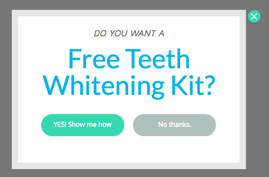
Here’s an example of a basic two-step popup. Two-step meaning if the visitor clicks yes they’ll be ushered onto the next window to enter in their information. A one-step opt-in would have the email entry form in the first window.
Two-step entry methods are said to be more effective because a visitor will be invested in the process once they start, thus improving the chances of them reaching the end.
What I like about this popup:
- Contrast. The design is kept simple with plenty of white space to emphasize the text.
- Call-to-actions. The language is precise. It details exactly what the visitor will accomplish by accepting the offer.
- Benefit. The headline is benefit-oriented. If you’re in the marketing for some teeth whitening this headline will directly appeal to you.
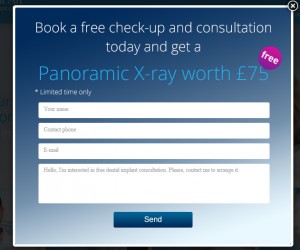
This is an example of a timed popup that offers a free dental check-up and consultation plus a panoramic x-ray. Once a visitor has explored the content on the site for 60 seconds they’ll see this offer.
What I like about this popup:
- Offer. The offer attached to this popup is quite compelling by my judgement. The business includes the dollar value further persuading visitors to claim it.
- Segmented. Because of the high value offer, this business has taken the opportunity to gather more information from their visitor. It will help them segment their leads in the future and increase the value of each lead gathered.
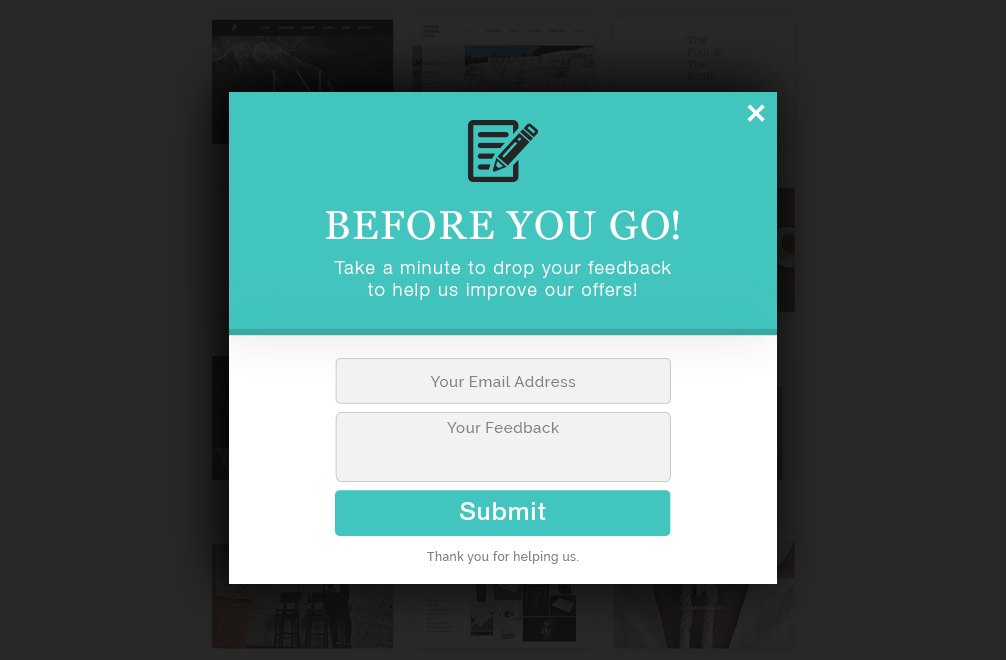
This is an example of an exit popup asking for feedback. Before a visitor leaves they’re prompted to leave feedback to improve the business in the future.
What I like about this popup:
- Contrasted. The copy is well contrasted against the form areas and the button. It makes it easier to read and grabs more attention overall.
- Language. For exit popups especially, it’s important to include language that makes a reader stop. “Before you go!” does a great job at grabbing attention and leading the reader down the copy.
Final Thoughts
Website popups can be a powerful tool in any online marketer’s toolbox. In the case of a dental businesses it has many applications.
It can help you grow your email list, navigate new visitors, pitch promotions, or decrease shopping cart abandonment.
Once you’ve built and published your popups, remember that the work isn’t done. Optimizations must be done through A/B testing. Test everything to improve the appeal and experience for your visitors.
Hopefully this information has shown you the power of a website popup. Try one for yourself and start actively engaging with the traffic coming to your website.
[/content-section]
[contentblock id=backtoindex-dentists]