The Complete Guide to Landing Pages for Dentists
Landing pages. For online marketers landing pages are one of the many tools for what we call increasing conversions.
In marketing-speak, a landing page is a webpage with a single conversion goal. Claim a discount, download a free ebook, or book a free consultation, any of these can be thought of as a conversion goal.
Landing pages are most commonly used by online marketers along with paid advertising because they’ve been proven to have higher conversion rates than a typical webpage.
Think about a website’s homepage.
When a new visitor arrives on a homepage they’re presented with an array of options. They can click on one of six menu buttons. They can visit the blog or maybe the FAQ page. Or maybe they’ll click on the Facebook link and head over there. There’s really no telling what they’ll do.
If you’re spending big bucks in advertising you obviously want the greatest return possible right? You want to maximize the number of people completing your desired conversion goal.
For that reason we want to use landing pages instead.
Below is a landing page used by Brighton Implant Clinic for their online advertising campaign. It’s meant to book visitors coming from online ads for a free dental implant assessment.
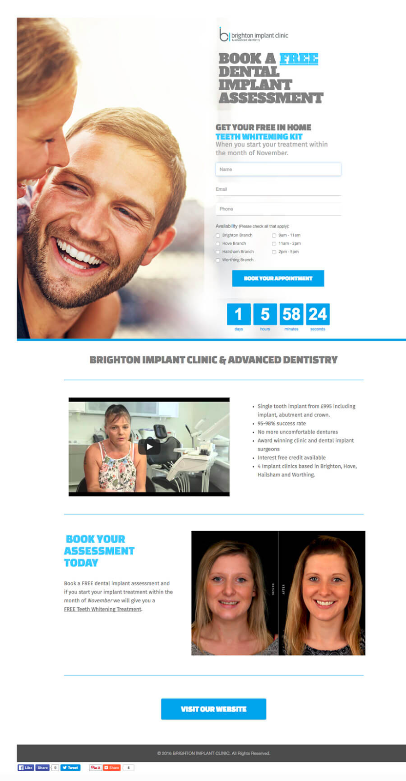
Notice how the entire landing page is built around the primary conversion goal at the top. The large images, the ample white space, and bright colours are all meant to push people to sign up for the free dental assessment. Compared to your typical webpage there is no menu, no footer, and barely any other links. A visitor has only 2 choices: book a free assessment or leave.
Now let’s talk about how to design a landing page people will convert on.
Landing Page Best Practices
We’ve already established the basic feature of a landing page; a single conversion goal.
For more in-depth overview on landing page best practices see our article on 8 Landing Page Design Best Practices.
Let’s go over 5 psychological tricks that will help maximize your landing page conversions:
- Visual cues
- Contrast
- Colour
- Imagery
- Format and typography
Visual Cues
The first thing to realize is that reading online isn’t like reading a book. It’s not left to right, top to bottom. Instead, studies show that online readers read in an F-shaped pattern. Content is read quickly, more like scanning than reading. Most readers will scan content and stop to investigate areas that interest them.
To help you direct visitor attention to areas of importance you can use visual cues.
Arrows and lines:
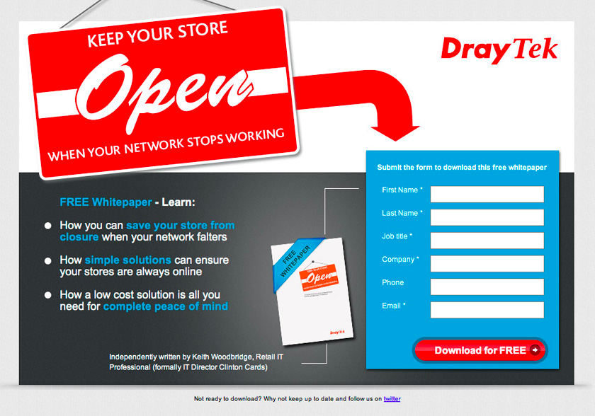
The most straightforward way to direct a reader’s attention is with a big bright arrow. In the example below a new visitor would start reading in the top left hand corner and move right. As the eye moves to the right the arrow would direct them down to the most important element of the landing page, the form.
This also applies to pointing or gesturing. If a big arrow doesn’t fit within your design you can replace it with an image of someone pointing toward the form.
Eye direction:
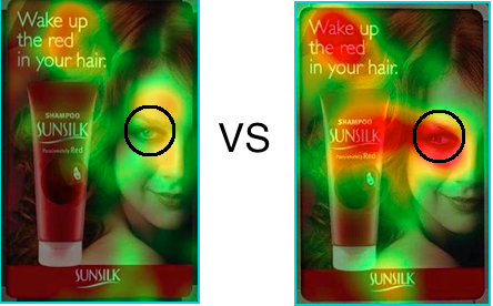
If a big bright red arrow isn’t your cup of tea you can make a more subtle visual cue with eye direction. Eye direction uses a large image with someone looking towards an area of importance to direct a visitor’s attention.
We all have an innate curiosity to explore what someone else is looking at. If you stand on the sidewalk and look upwards, chances are passerbys will look up too. If you turn backwards to look at someone arriving to class late, your classmates will too.
The example below uses eye direction to direct a reader’s attention to the product. Heatmaps that track visitor attention show that a simple change in eye direction places more attention on the product.
Contrast
We all have that one tall friend that makes us look short when we’re with them. Or that one buff friend that makes us look skinny. It’s all just contrast.
Contrast is important for landing page design because the human brain is meant to pick up on differences. Especially when it comes to contrasting colours, people immediately notice a difference.
We can see a strong use of contrast in the example below. The vibrant aqua colour is well contrasted with the white form. Thus our eyes pick up on the difference and our attention is drawn towards the form. The bright orange button stands out even moreso.
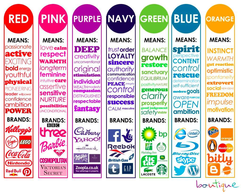
Colour
You may not realize it but colour has a huge influence on the way we conceptualize things in our environment. The same goes for brand colours and the way they communicate with their audience.
Colours that don’t quite fit with the message you’re communicating can be the difference between a conversion or a missed opportunity.
See how colours influence a brand’s communication in the example below.
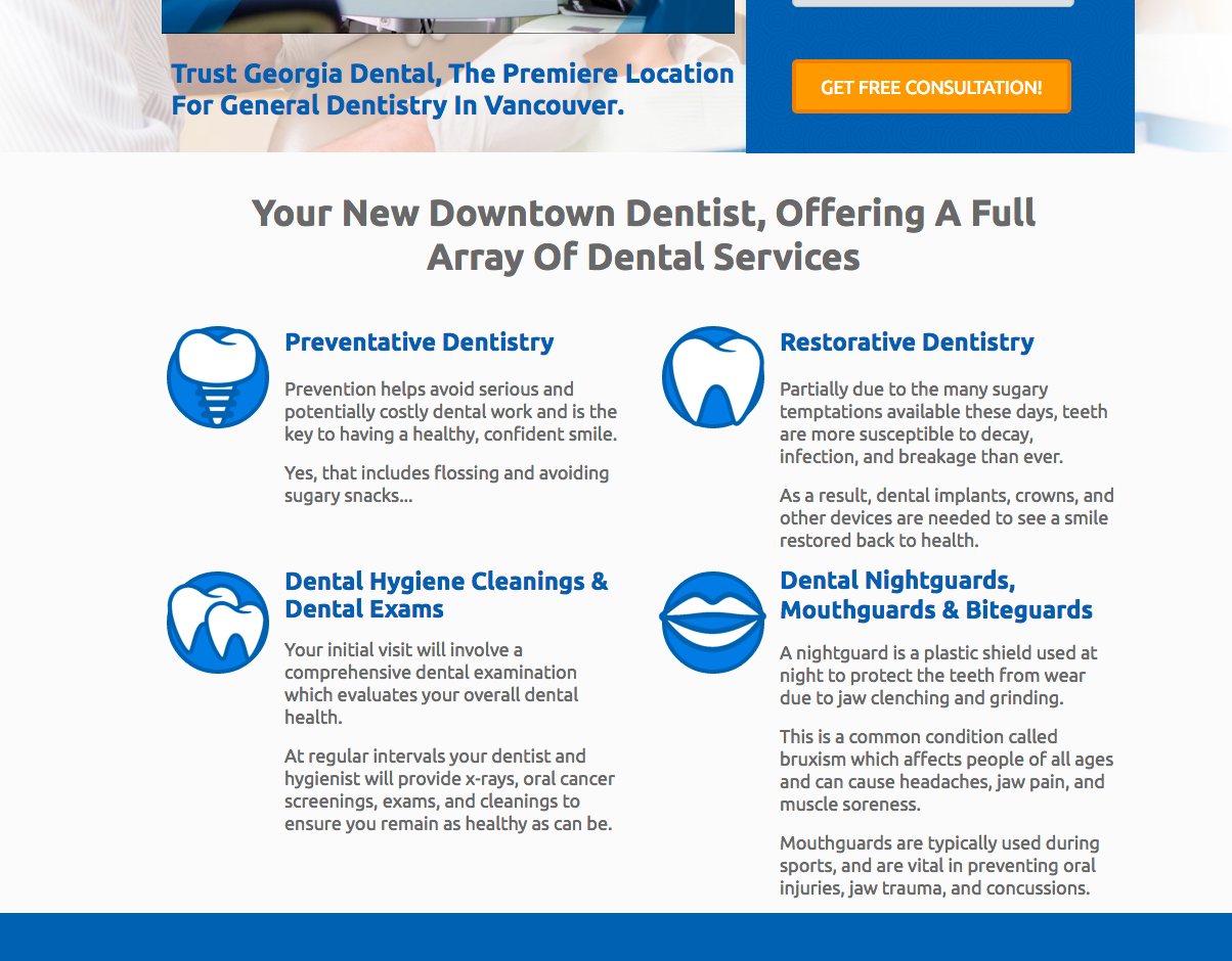
Imagery
Just how colours have an impact on the way we understand our environment, your use and choice of images say one thing or another.
An image of a happy user or customer can provide the subtext for a compelling story for example. Viewers focus on the faces of people in images and attempt to decipher a deeper level of meaning.
As I said before, a majority of online readers scan instead of read. Images in that case, can be of great help in your landing page design. What needs to be communicated quickly can be done with images. Instead of a large block of text, use an appropriate image to help the reader understand the concept quicker.
Graphics or icons act as symbols. Much like road signs, graphics can help your visitors read content on the page much faster and with more efficiency. In the example below, readers can get a sense of each section by looking at the accompanying graphic before even reading the copy.
Format and Typography
To the untrained eye format and typography aren’t evidently as important as the others. But a slight change in the arrangement and look of your landing page copy can have dramatic differences. When it comes to landing pages the little details matter.
To see a stark example of this just look at any low budget website versus one that received professional development. High quality, well-designed web pages are simply more professional thus are deemed more trustworthy.
Experiment with typography by…
- Testing different typefaces (fonts) to see what your visitors respond to. Pair fonts that match well with one another. Your choice of font communicates certain things to the reader. It may not be immediately apparent but it pays to use a professional designer to select typefaces for you.
- Playing with size. Like how we talked about contrasting colours, contrasting font sizing draw attention. Big bold headlines should command attention compared to the smaller subheadline.
- Text length. What works better, a short and snappy headline or a long descriptive headline? Short and succinct or lengthy body copy? Are short 3 sentence paragraphs better or traditional long paragraphs? Experiment with your audience to see what works best.
A/B Testing
Once you’ve designed a landing page for your business and send some traffic to it your work is only half finished.
Your landing page won’t be running at maximum efficiency until you optimize your conversion rate. This involves testing each and every area of your landing page to see what performs best. It’s called A/B testing.
Say we want to test a different headline to see if more people convert and book a free consultation. A landing page building platform (like Wishpond) will send half of your traffic to your original landing page and half to your landing page with the new headline. Whichever landing page performs better will become your new landing page. That’s A/B testing in a nutshell.
To conduct an A/B test on your own think of grade 5 science and start with a hypothesis. What prediction or hypothesis can you make according to the audience you’re trying to engage?
For example, if you hypothesize your audience has a short attention span, you might try shortening your copy and moving your form closer to the top.
If you hypothesize that your audience isn’t engaged or responding positively to your landing page, you might add a lively header image of a happy family to the top.
Performing regular A/B tests like these will improve your conversion rates overtime AND make you more familiar with the online habits of your audience.
To learn even more about A/B testing, take a read through our article How to A/B Test Your Landing Page to Maximize Conversions.
Landing Page Examples
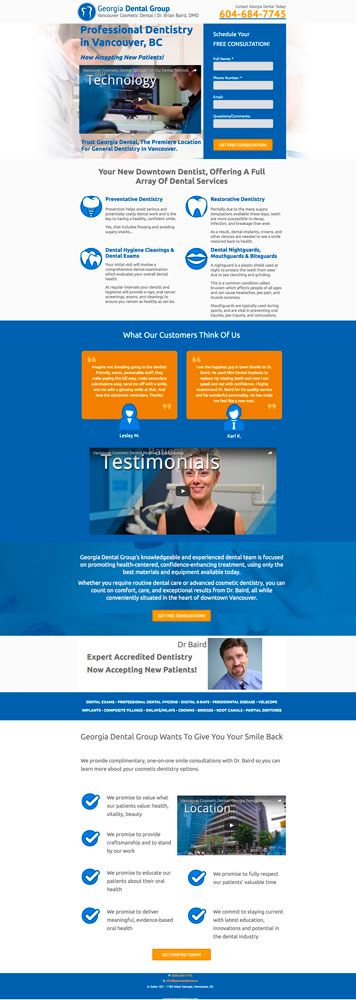
Why we like this landing page:
- Contrasted. The areas with text are well contrasted with the background colours. Blue, white, and orange play against one another excellently.
- Imagery. Visuals are littered throughout each section to help the reader move down the page. Tiny graphics assist the services offered section and the testimonials.
- Video. Video on a landing page has been proven to add an extra element of persuasion. High quality video is a mark of professionalism and is an extra layer of convenience for those who won’t read all the copy.
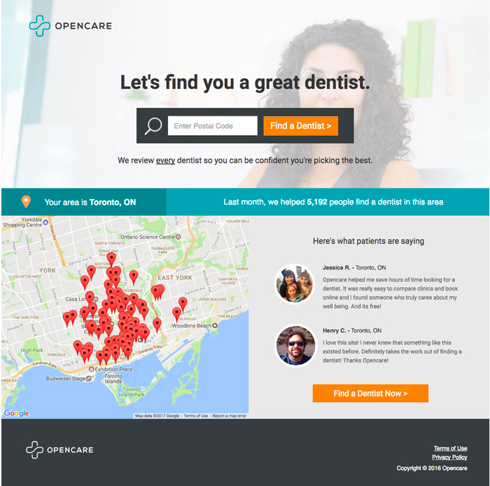
Why we like this landing page:
- Length. Only the necessities are present on this landing page. The primary call-to-action is placed at the top of the page and at the bottom as well.
- Social proof. Testimonials and the number of people they’ve help add social proof to the equation.
- Visuals. The map shows all the locations for dentists within their area. It adds an extra layer of personalization to the searcher which persuades them to continue their journey.

Why we like this landing page:
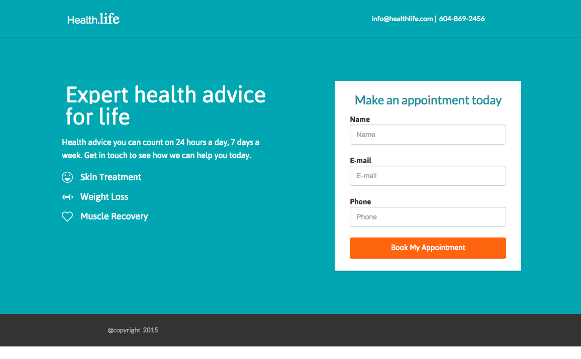
- White space. Nothing distracts from the headlines, photos, or text. Ample white space makes everything clear and legible. The changes in text colour from blue to dark grey keep things clear and easy to read.
- Imagery. Strong visual images lead the reader down the page. Bright white smiles creates an environment that a reader would further investigate.
Wrapping Up
Hopefully you’ve come away from this article with a newfound interest in creating a landing page for yourself. If you’re driving traffic to your homepage you’ll need to reevaluate your strategy. The array of options and avenues on your homepage distract your visitors from converting.
Using a landing page is proven to improve conversions for one reason: a single conversion goal.
Remember to leverage psychological tricks to persuade visitors to convert. They were…
- Visual cues
- Contrast
- Colour
- Imagery
- Format and typography
After that you’ll move onto testing and improving your landing page. Until you’ve optimized your conversion rate your work is not over.
The best landing pages are always tested. Optimize and most importantly, be as creative as possible. Only you know your audience and by optimizing you’ll get to know them even better.