The Complete Guide to Landing Pages for Fitness Centers
As a fitness center, you know how important it is to connect with potential customers. It’s tough to convince people to become members the first time they interact with your product or brand.
Often, it’s continued interactions with customers through things like phone, email, or social media that convinces them to join your fitness center.
That’s all well and good, but before you can do that, you need to connect with these customers in the first place by generating leads. We already know how to drive traffic, but we need somewhere to drive it to.
Your homepage? Maybe – but we want potential customers to do something: enter a contest, tour your gym, take a yoga class. We want conversions, and your homepage isn’t optimized for them. There’s too much information and too many places to go.
Enter the solution: landing pages.
Though they’re similar to standard webpages, landing pages are optimized for one goal, and one goal only: get people to convert.
In this guide, we’ll take a look at all things landing page-related, including landing page best practices, landing page A/B testing, use cases, and examples.
Ready? Let’s go.
What is a Landing Page?
As explained in this blog post, a landing page is a single page on your website built to achieve a single conversion objective. It’s a page that’s designed, written, and created for a single purpose.
For your fitness centre, this could mean a number of different things, like booking a gym tour for a potential member or signing someone up for a free trial class at your yoga studio. Landing pages don’t want you to sign up for a gym and buy workout clothing and contact a trainer – they only have a single ask.
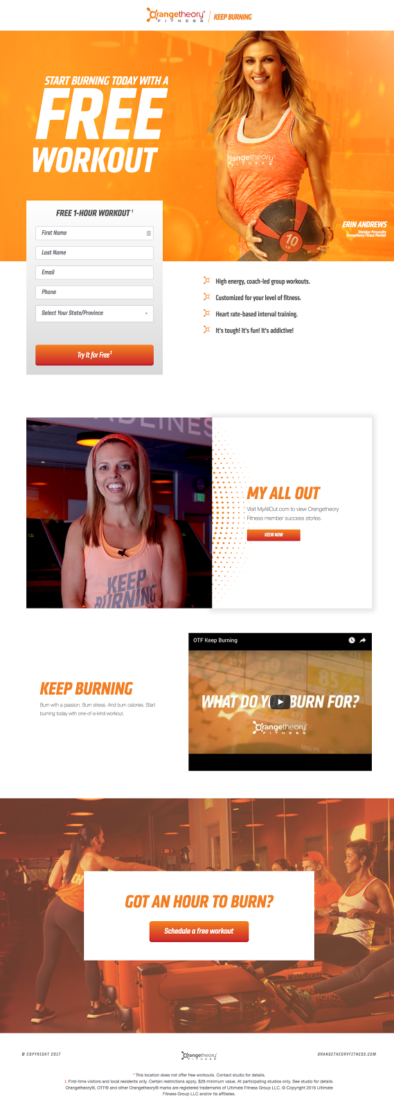
Here’s an example from OrangeTheory – as you can see, the page is designed to get visitors to sign up for a free workout:
Landing pages are the perfect companion to the traffic-driving strategies we covered previously in this guide. Whether it’s Google AdWords or Facebook Ads, sending your visitors to a landing page helps ensure they’re helping you reach the goals you’ve set for your business, whatever they are.
Landing Pages vs. Websites
A common question marketers have is, “how is a landing page different than my website or homepage?”
Makes sense. At first glance, they look rather similar. After all, a web page is a web page, right?
Wrong!
Think about your homepage.
It acts as the virtual front door of your fitness center, which means it needs to do a lot of things for all of your visitors. It contains a ton of information about your business, including contact information, membership plans, training programs, and more. Maybe you have a blog, member testimonials or educational videos.
All of these things serve different purposes meant for different people in your target market. When you look at your homepage, look at how many different routes visitors can take – chances are, it’s not exactly optimized for conversion. You have CTAs like “sign up now” or “learn more”, but they’re all meant for different things.
Long story short, your homepage doesn’t have a single explicit goal. Conversely, a landing page is built for conversion – it has one goal, and the entire page is designed with this goal in mind.
Specifically, you’ll notice landing pages tend not to have links to other parts of a website (usually there’s no navbar). Almost all of the links on a landing page direct the visitor to a popup or form where they can complete the action the page is designed for.
Landing pages are also much more specific. For your fitness center, each landing page you create should be focused on a single product or service; for example, a page for personal training or a page for hot yoga classes.
Get it? Good – let’s move on.
12 Landing Page Best Practices
Every landing page is different. Yet, there’s a few rules of thumb you can follow while putting together your first landing pages – at least until you’ve figured out what works for your business. Let’s tackle these piece by piece – there’s quite a few, so buckle in!
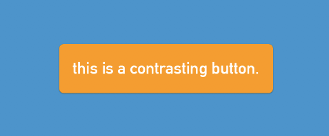
- Use contrasting colors for your CTA buttons. Your CTA button should be the centerpiece of your landing page. Using a contrasting color to make your CTA buttons stand out draws viewer attention and highlights your conversion goal.
- Make your CTAs action-oriented. Think about the action your audience will complete, and use that to build your CTA. Instead of leaving your conversion button saying “submit”, make it something like “get my 7-day pass” or “book my tour”. You want to highlight the benefits of conversion right in the CTA.
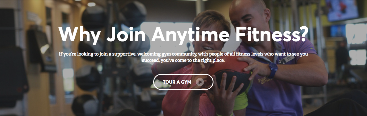
Anytime Fitness has an action-oriented CTA to book a gym tour.
- Use directional cues. The best landing pages feature directional cues to highlight your form or a specific offer. A directional cue can be something as obvious as an arrow, or even something more subtle like a person’s eyes. These things all contribute to pulling a page viewer’s attention to the important parts of your landing page.
An example of a directional cue.
- Use location to command attention. It’s well-documented that people generally read websites in an “F” shape (look at Google’s search results page for a clear example of this layout). Put the most important sections of your page at the top-left to make sure your viewers see them.
- Use real photos from your business. As handy as stock photos can be, nothing beats an image from your fitness center. I understand it can be difficult to find the time (or sometimes the budget) to take these photos, but it’s worth it to help you show off your facilities, your customers, and anything else you want to highlight.
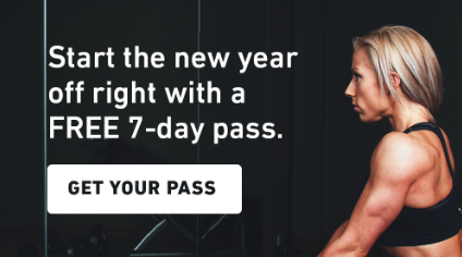
- Create urgency. If your landing page highlights some sort of offer like a contest or free incentive, push viewers to act by adding a countdown timer to your page. This works by getting viewers to act before it’s too late, or before they forget about it.
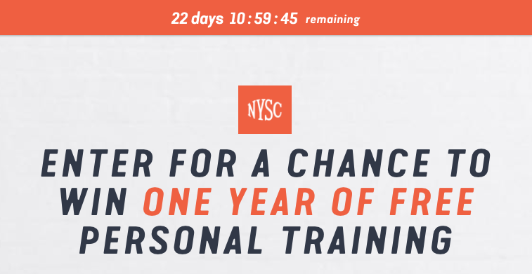
A “hello bar” with a countdown is a great way to create urgency.
- Keep important objects above-the-fold. “Above-the-fold” refers to the part of the page you can see without scrolling. Put the most essential part of your page above-the-fold – this includes things like your form and your headline – to make sure all page viewers see them.
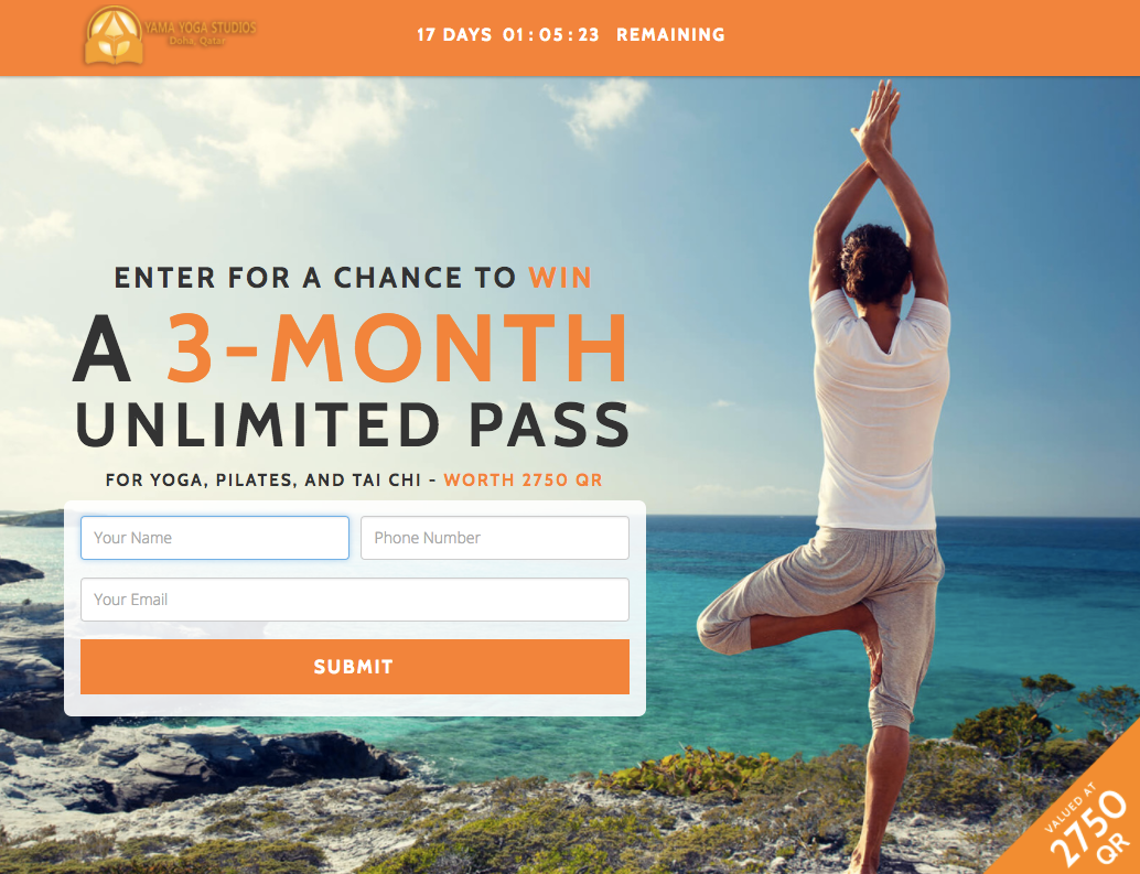
Yama Yoga has their form and offer above-the-fold.
- Make your copy skimmable. Though I’d actually suggest you minimize the copy you put on a landing page, I understand that’s not always easy (or possible). You can make your copy more easily digestible by creating point-form lists or spreading out your copy.
Putting copy in point form makes it skimmable and easily-digestible.
- Try a video! Though there’s no conclusive evidence that having a video is necessarily better than not having one, it can definitely help in certain situations. If there’s certain parts of your fitness center that are better explained in video format, don’t hesitate to try it. Just remember a video will make your page load slower – so use it sparingly.
- Make it mobile-responsive. This is one of the most important pieces of a landing page. Fact of the matter is, you can’t be sure that all (or even most) of your traffic is coming from people using their desktops or laptops. Mobile usage is skyrocketing – make sure your page works and looks great on any device.
- Limit your number of form fields. Of course, you want to know as much about your leads as possible. To optimize conversions, however, and generate as many leads for your business as possible, you’d be best off minimizing the amount of information you ask from potential customers. That being said, don’t be afraid to ask things like “what kind of exercise are you interested in” or “what are your fitness goals” – these can help you segment leads, increasing conversions in the long run.
- Leverage social proof. One of the most convincing ways to convert a lead is to show them that there are other people like them who are happy with your business. Look to current (or past) customers who have been happy with the results your fitness center has worked with them to achieve, and ask them for a testimonial. Make sure to highlight benefits over features (“Vitality Fitness gave me the energy I needed to spend time outdoors with my kids” vs. “Vitality Fitness has great equipment”), as it’s much more compelling.
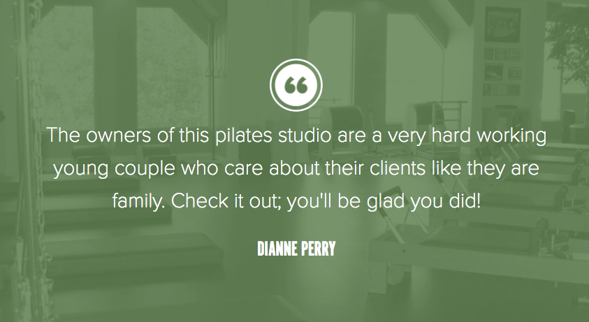
Embody Pilates’ landing page features a customer quote.
A/B Testing Your Landing Page
Just like in weightlifting programs or yoga routines, the same things don’t work for everyone – or for every landing page. That’s why it’s so important that you’re constantly testing different ways to improve conversion rates, so you can generate as many leads as possible for your business.
A/B testing your landing page means creating two variations of the same page and showing them to people over a period of time to determine which is more successful. Generally, you’ll only want to change one element each time you run an A/B testing, so you can pinpoint which parts of your page affect conversion rates positively or negatively.
A/B testing helps you establish foundations and rules that you can use moving forward, when you create other landing pages or other lead generation tools like popups.
Here’s a list of things you can A/B test on your landing page:
- Headline capitalization (all-caps, sentence case, title case)
- Countdown timer vs. no countdown timer
- Hero image (person, object, etc.)
- CTA copy (“sign up now”, “book my tour now”, etc.)
- CTA button color
- Form fields (number of fields, dropdowns vs. single line text, etc.)
- Different testimonials
- Video vs. no video
- Organization of page
- Length of page
A/B test these things and see how they affect your landing page conversion rates!
3 Landing Page Examples
ClassPass
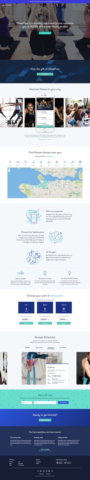
- As a note, this is not a lead generation-focused page. Because ClassPass isn’t a huge monetary commitment, they’ve found it best to send visitors right to pricing.
- The hello bar highlights a special offer with a specific value (“for only CA$19”) and is a bold blue, which helps to draw attention.
- The headline clearly conveys the benefit of having a ClassPass.
- CTA buttons are in bright blue, which contrast but are still on-brand.
- Against best practices, ClassPass actually features multiple CTAs. This is fine, as all of these CTAs still point viewers towards a conversion goal, just along different avenues (buying for yourself vs. for someone else).
- I actually like the second CTA (“Buy a gift”). Clearly, ClassPass has done their research and a large portion of their market buys ClassPass as a gift for others.
- The iPhone portion of the page serves to show off the ClassPass mobile app, which tips visitors off to how easy it is to book classes.
- The map portion of the page is brilliant – it uses location data (I’m guessing IP address) to instantly show the visitor locations near them where they can use ClassPass, as well as a list of activities they can take part in.
- You’ll notice by this point in the page that copy is quite sparse, yet there’s still quite a bit of useful, easily-digestible information. For me, that’s indicative of a great page.
- The next sections highlight more concrete benefits of ClassPass – the copy makes these benefits clear and even serves to reduce possible anxiety or uncertainty (“With no annual contracts…”).
- I like that ClassPass shows their prices and features multiple pricing plans. It shows that they have something for everyone.
- The “Sample Schedules” section is great; it’s like the ClassPass equivalent of a product demonstration. Again, this shows how ClassPass has something for everyone – and how exactly it can work for different people.
- I like that ClassPass has included an email opt-in, in case visitors aren’t yet ready to buy.
- Finally, ClassPass’ FAQ helps further reduce uncertainty and addresses common questions potential customers might have.
GoodLife Fitness
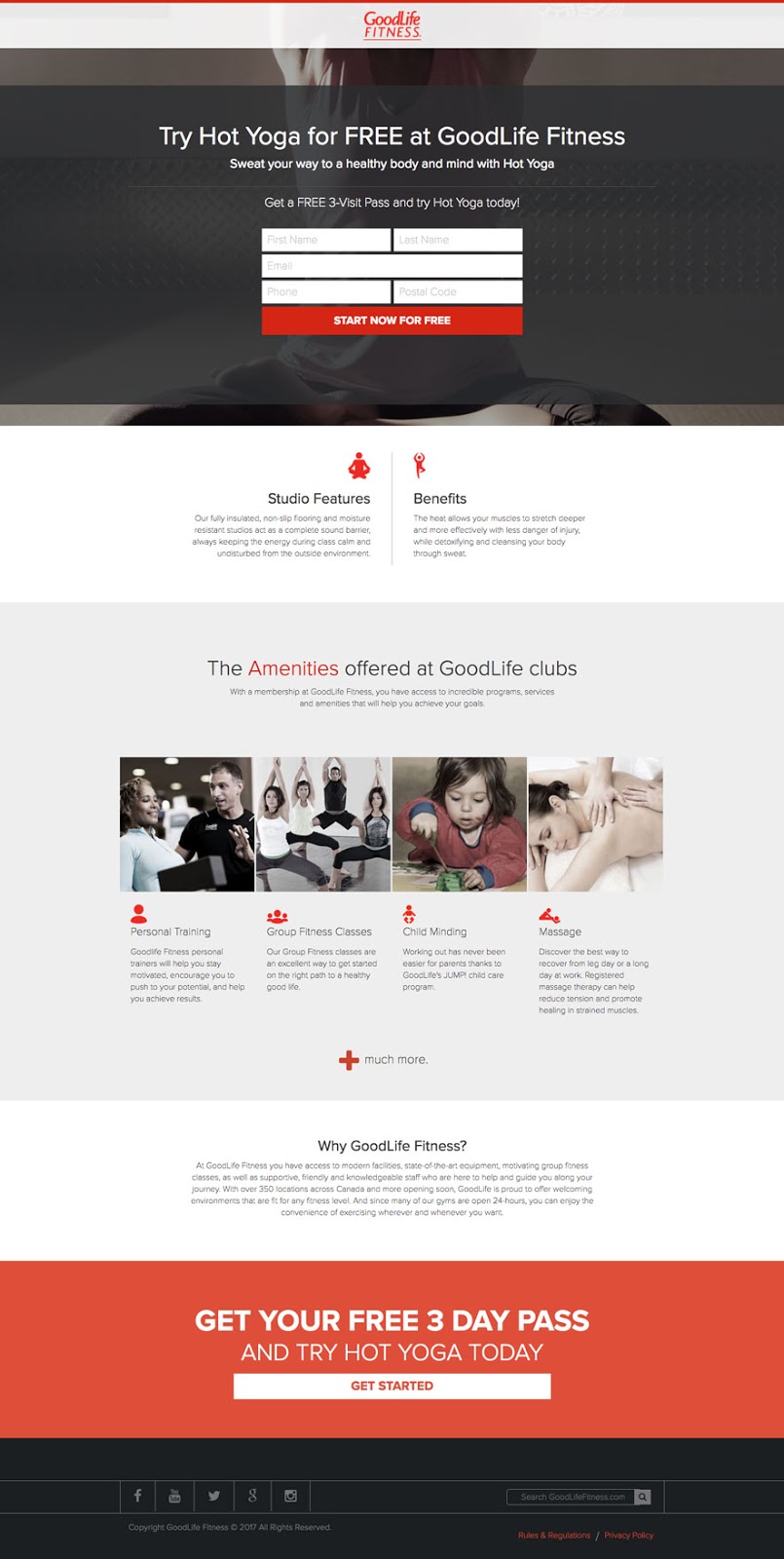
- The headline is clear and highlights the offer: visitors can try hot yoga for free.
- I like that “free” is emphasized in caps. This helps to convey value, and it’s repeated in the copy right above the form.
- I like that the CTA button is in bright red (which contrasts lightly with the softer red of the GoodLife logo). The CTA copy is great as well, as it clearly highlights the offer (“start now for free”).
- GoodLife does a good job in highlighting both features and benefits in the next section for those who might want to know more about the location, as well as those who may not be aware of the characteristics of hot yoga. Something that might have been good here is an image showing someone doing hot yoga at a GoodLife location, to better showcase the facilities.
- The amenities section is good in terms of copy, but it feels a bit out of place on this page. You’ll notice here that the landing page moves from being hot yoga-focused to talking about GoodLife in general. A viewer might be put off by this, as it might ask them to commit to more than just yoga.
- “+ much more” is good, but it should link to a benefits page. If not, it should be removed.
- The “Why GoodLife Fitness?” isn’t skimmable – the paragraph should be split into points.
- The bottom red section of the page is great! I like the big, bold font and the large CTA button.
- Overall, this page is OK – it should have remained more hot yoga-focused, which would have helped to maintain a central theme for viewers who entered from an ad for “yoga”.
Salubrity
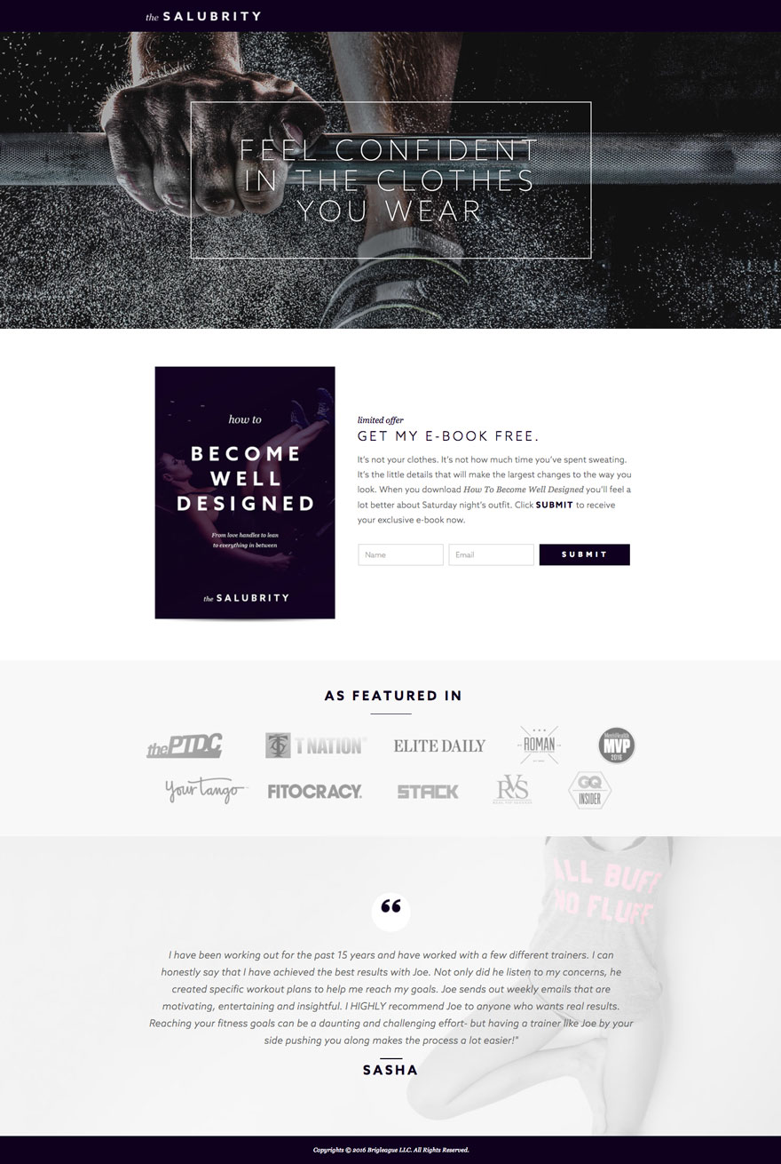
- I chose to highlight this page because I love the offer: a free e-book about looking better in clothes. This shows a strong understanding of the business’ target market. It’s not just about being fit, it’s about being fit to make clothes look better.
- The hero image at the top is striking, though it might be better suited if it was a zoomed-out image of someone lifting weights; this would show the person’s clothes and would be more in line with the page’s theme.
- The headline is great – it’s engaging, in all caps, and conveys a singular benefit: feeling and looking better.
- A CTA button under the headline that links to the form might have been a good idea here.
- I like that the page shows the e-book cover; it makes it feel a little more “concrete”. I think a preview of the book would have been even better.
- The copy above the form (“get my e-book free”) is a little jarring, because a reader might not be sure who the sentence is referring to. “Get your free e-book” would have been better.
- The form is only two fields – it’s awesome! I would have preferred if the conversion button was brighter, and if it was more action-oriented (“Get my free e-book”).
- A couple points on exactly what to expect in the book would have been a good addition to the page.
- I like the “as featured in” page, as it establishes credibility amongst page viewers.
- Finally, the testimonial is great, though it was a little long. A picture would’ve been helpful as well, to make the testimonial more “real”.
- I like that this page is short and to the point, though it could feature a profile on the trainer or more information on the e-book.
Conclusion
There you have it – a simple guide to creating, optimizing, and testing landing pages for your fitness center.
Hopefully now you have an understanding of why landing pages are so important for your business. A landing page is the perfect place to drive traffic to – it’s specially designed to get your visitors to complete an action, whether that’s signing up for a class, booking a tour, or getting a free pass.