The Complete Guide to Popups for Fitness Centers
Ah, pop-ups. Just the mention of them sends shivers down the casual internet user’s spine.
They’re called “intrusive”, “annoying”, even “infuriating”, by non-marketers and marketers alike.
Pop-ups are the outcasts of the digital marketing world – yet, they’ve stuck around for year after year in a digital marketing landscape that rapidly grows, changes and evolves.
Why?
Well, to put it simply, they work. As much as people love to say they hate pop-ups, there’s proof that they’re effective at increasing conversion rates and turning disinterested website visitors into engaged leads. This means more members for your fitness center.
Why do pop-ups work?
First off, people have short attention spans. When they visit your website or one of your landing pages, it’s easy for them to miss one of your CTAs or ignore your form altogether because they’ve been distracted or they got bored.
A popup can take a viewer who’s about to leave your page and re-focus their attention on the offer you’re making in exchange for their lead information. They present an opportunity directly to a viewer, which makes them more engaging than the landing page or website they’re on.
Next, they’re attention-grabbing. Popups are so strong because they literally pop up, alerting the viewer to the offer you’ve chosen to highlight. Popups demand focus, as most are “lightboxed”; they dim the rest of the window behind it, directing the viewer’s eyes (and attention) to the featured offer. Pop-ups say “look here”, increasing the chances someone will convert.
Finally, they create urgency. Compared to something like a landing page, a pop-up feels fleeting and exclusive. It’s easy for someone to get back to a landing page – they just need to bookmark its URL. More likely than not, doing this gives people time to forget about your offer, meaning a lost conversion.
When a pop-up is combined with an enticing offer (like a membership discount or free training session), they create a strong call to “act now”. Often, people convert on pop-ups to avoid missing out on a potentially rewarding offer.
Pop-up use cases
Now that we’ve gone over pop-up best practices, let’s look at a few ways you can use pop-ups for your own business.
Keep in mind that we’re looking at using pop-ups as a tool for lead generation; thus, all of these use cases revolve around using pop-ups to gather leads for your business that you can turn into members.
Though not all of these will apply to your fitness center, I’ve tried to include cover use cases that will fit multiple business types, including gyms, yoga centers, dance studios, and more.
Ready? Let’s hop into it.
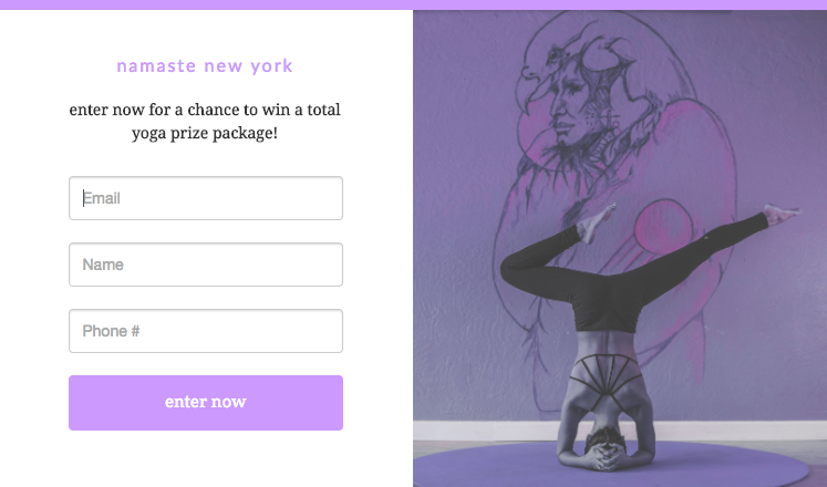
Contest promotion
What better way to use your newfound contest knowledge than to create a pop-up to get people to enter it? If you find you have high website traffic (from all that local SEO you did… you did do it, right?) that you’ve had trouble turning into members, a website popup promoting your contest can be just what you need.
I’d recommend a timed, exit, or even an entry popup – this ensures everyone who visits your site will be aware of your contest offer.
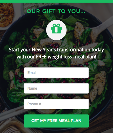
Nutrition plan
Giving out a nutrition plan is a great introduction to any personal training or transformation services your fitness center offers. Put together a great PDF, detailing a week (or month, etc.) of meals that suit your prospective customers’ goals.
I’d make these click pop-ups linked to a CTA like “get your free nutrition plan”, and I’d actually create separate landing pages based on customer goals (e.g. “lose weight” or “gain muscle”). Exit pop-ups work well for this, too.
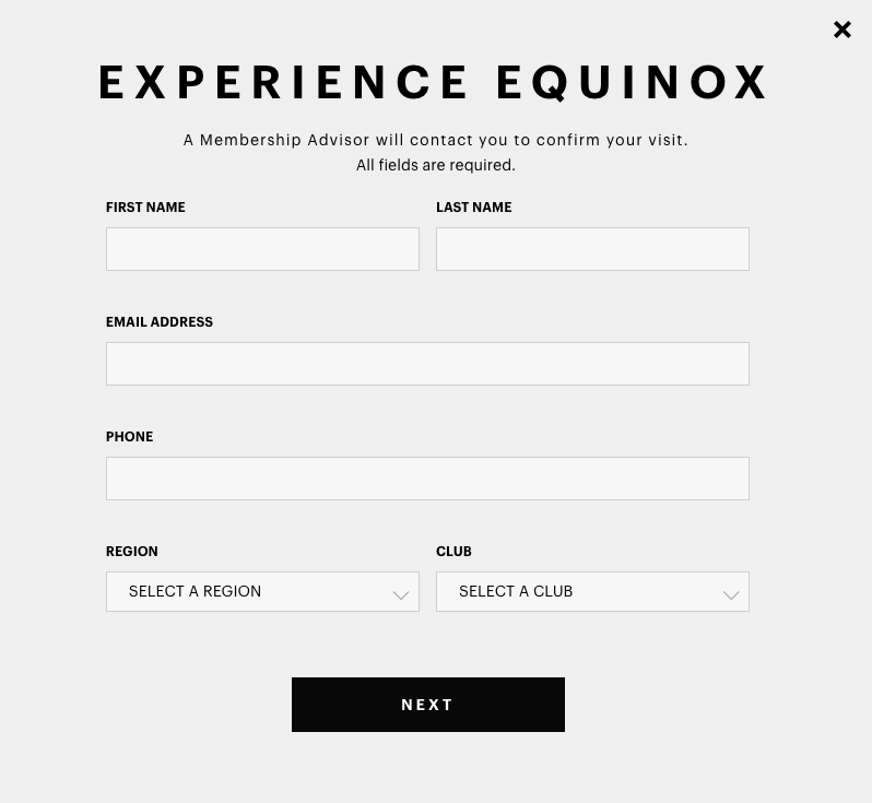
Fitness center tour
A fitness center tour is another great incentive. Sometimes, all you need to get someone to become a member is to get them in the door. Pair a CTA (“Check us out for yourself!”) with a pop-up – click pop-ups attached to buttons that say something like “book a tour” work well.
Tours are awesome incentives (though time-consuming) because they give you the chance to show a potential member your facilities in real life (as opposed to through photos on Yelp). This introduces the opportunity to sign them up for a trial class or sell them on a membership.
Discount/free pass
Everyone loves free stuff! I’d argue that offering your customers a discount or free pass is the best way to get them to give you their contact information. On top of this, it’s also the best way to turn these people into members.
Offering them a discount or free pass to a group fitness or yoga class directs them right to the front door of your fitness center. This allows you to take the lead nurturing process into your own hands as you show them firsthand the benefits of your training.
Any type of pop-up will work for this, really, but I’d suggest an exit pop-up to draw in page viewers who may have been on their way out.
Types of pop-ups
There a few different types of pop-ups that are best-suited to different situations. I’ll go over them quickly here!
Entry pop-up
Probably the most “traditional” type of pop-up, entry pop-ups trigger as soon as a visitor reaches a page. These pop-ups are generally pretty uncommon these days, since they’re intrusive – they block page viewers from getting a meaningful glance at the page before appearing. I’d avoid entry pop-ups in most cases, unless there’s something your viewers need to see.
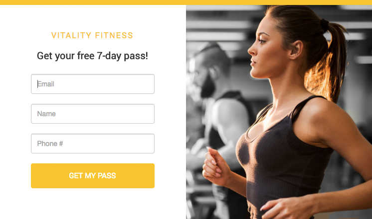
Example: Steve Nash Fitness World
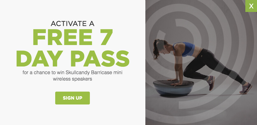
This is a pop-up that appears when a visitor arrives at Steve Nash Fitness World’s homepage. I like that the copy text is big and bold – it captures viewers’ attention and clearly highlights the offer: a free 7-day pass.
Besides the awesome offer, they also mention a giveaway for wireless speakers. Even if viewers aren’t totally interested in the pass, they might be tempted to sign up anyways for the speakers. This helps Steve Nash generate leads that can be nurtured in the future.
Click pop-up
Click pop-ups are user-activated, and are attached to things like hyperlinks, images, and CTAs. Instead of opening a page in a tab or window, clicking an object linked to a click pop-up causes a pop-up to appear in the current window. This type of pop-up is great because the user remains on the original page, even if they don’t convert on the pop-up.
Example: GoodLife Fitness
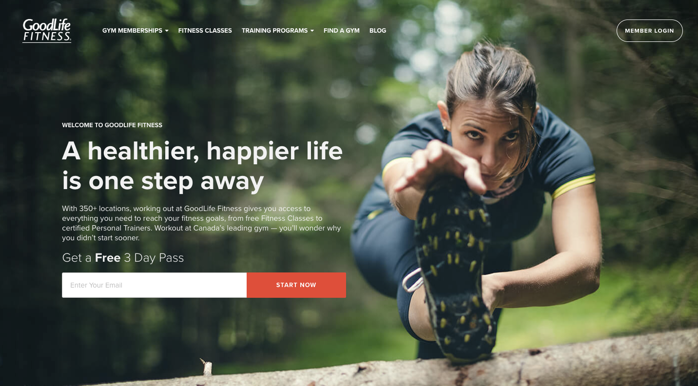
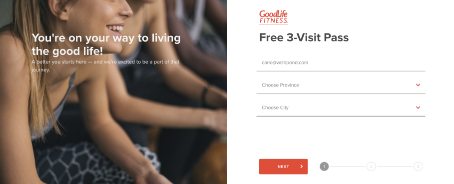
This is one of my favorite pop-ups. It’s a little bit sneaky – the first thing a viewer sees on GoodLife’s homepage is an offer for a free 3 day pass, with a single form field. Great – GoodLife has a simple, enticing offer for potential customers.
Once someone clicks the “start now” button, however, a click popup triggers for a visitor to fill out the rest of their information. The copy (as well as the pre-filled email form field) makes a visitor feel like they’ve done most of the work already – they might as well finish the rest of the form! This is an inventive way to approach multiple form fields, which can scare some visitors away.
Scroll pop-up
Scroll pop-ups appear when someone has scrolled down a percentage of your page (for example, 30%). Scroll pop-ups are a good way to target users who have shown an interest in your landing page or content, as they need to have seen a certain amount of your content to trigger the pop-up. I’d recommend not showing your scroll pop-up anywhere before 50% of your page (though of course, this depends on the page’s length).
Example: Greatist
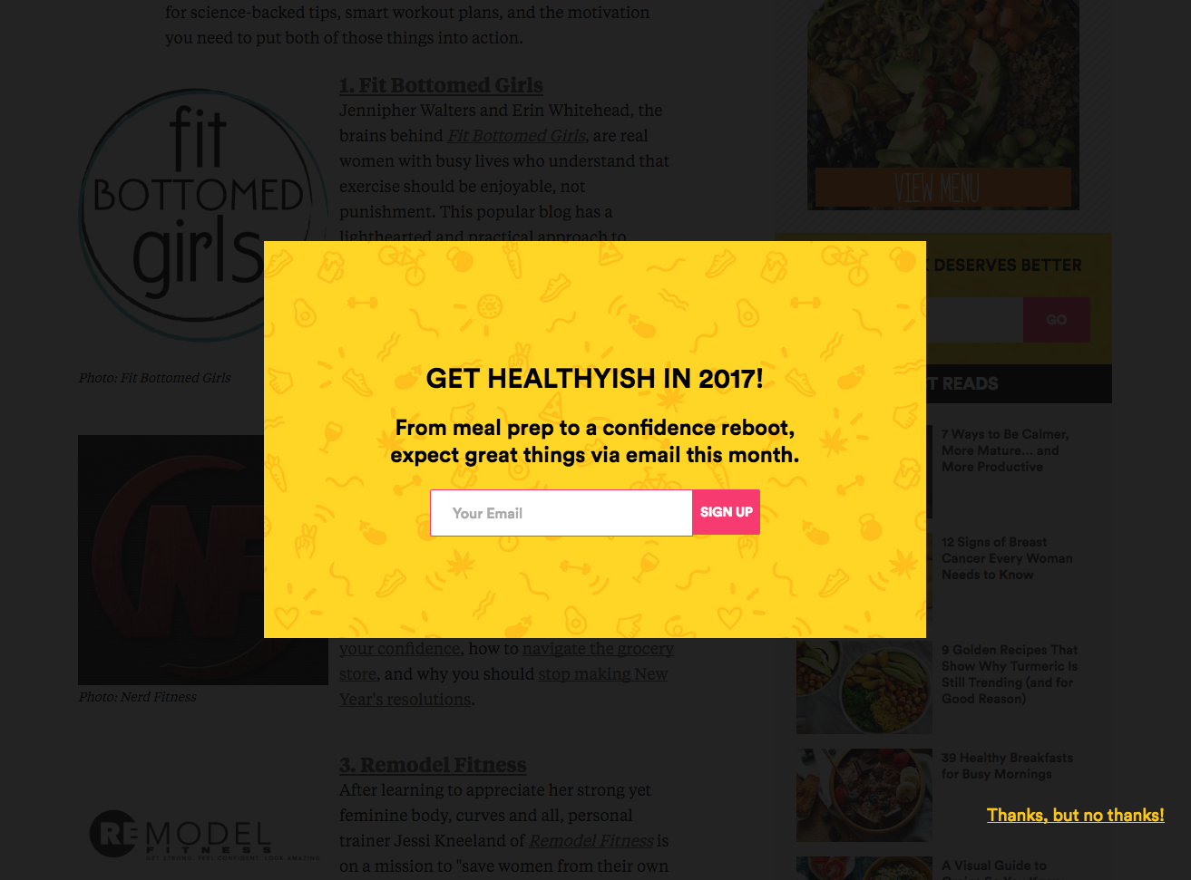
Fitness blog Greatist triggers this scroll pop-up about halfway through their blog posts. I like that they use scroll pop-ups for their blog; it allows them to identify (at least somewhat) readers who are interested and engaged with their content.
The pop-up design is great, and it’s topical (“…in 2017!”). I like that Greatist clearly states what potential email subscribers can expect if they sign up to the Greatist email list. It’s also a single form field, which means Greatist is unlikely to lose potential subscribers because there are too many fields to fill. Overall, this is a great pop-up.
Timed pop-up
Like the name suggests, timed pop-ups trigger once a visitor has been on your page for a predetermined amount of time. Similar to scroll pop-ups, timed pop-ups trigger for users who have shown at least some interest in your content (they need to have been on your page for a little while to trigger them). Case studies generally agree that timed pop-ups should trigger in less than a minute, though you can experiment with this based on your results.
Exit pop-up
Conversely to entry pop-ups, exit pop-ups are the most common type of pop-up nowadays. Basically, they trigger when someone is about to leave your page by tracking the location of the user’s cursor. Once the user’s cursor leaves your page (usually to close the tab or go back), your exit pop-up triggers. Exit pop-ups are a last ditch effort to get a conversion from your page viewers, and they can often be quite successful.
Pop-up best practices
When you’re putting together pop-ups for your landing pages or website, there are a few things you should keep in mind.
- Offer an incentive. Most of the time a pop-up isn’t enough to generate a conversion. Draw people into converting by putting together a special offer, like a coupon code for a free yoga class or a gym membership discount. This offer, combined with the urgency pop-ups tend to create, helps to get page viewers to act immediately and convert.
- Offer content. If, for whatever reason, you’d rather not offer a discount of some sort as an incentive, you can look into offering a piece of content. This usually comes in the form of a PDF or video and could be something like a workout routine or nutrition plan. They’re great for generating leads you can later nurture with drip campaigns.
- Make your pop-ups easy to close. There’s nothing more frustrating than a pop-up that just won’t go away. Personally, I’d rather close the whole page than spend extra time trying to close the pop-up. Whether your exit button is a simple “X”, a button, or text, make it prominent and easy to click.
- Trigger the right pop-ups for the right people. I’d recommend using a third-party pop-up app to make sure your pop-ups show up on the right pages, and that they’re not triggering for people whose lead information you’ve already collected. I’d also make sure you don’t show the same pop-up to the same people more than once or twice… that’s spam, and it’s annoying.
- Don’t combine pop-ups. Keep your pop-up limit to one per page. It’s incredibly frustrating to close one pop-up only to have another appear – you won’t magically get a conversion by immediately triggering another pop-up for someone who’s closed one already.
- A/B test your pop-ups. Utilize a pop-up tool to try out different pop-up strategies and test for conversion rates to optimize the number of leads you generate. More on this in the next section…
A/B testing your popup
An important part of achieving pop-up success is testing and changing different things to optimize your pop-ups for conversions. The best way to do this is A/B testing.
What is A/B testing, you ask?
Simply put, A/B testing a pop-up involves showing two different variations of the pop-up to the same audience to see which one has the most success. Here’s an A/B test example – as you can see, the text on the button for each pop-up is different.

When A/B testing a pop-up, I’d recommend only changing one element on your pop-up at a time; for example, your copy or your image or your CTA. This allows you to identify what’s affecting your conversion rate and allows you to understand what will convert well the next time you create a pop-up.
Here’s a few things you can A/B test on your pop-up:
- Countdown timer vs. no countdown timer
- Background image vs. no background image
- Type of image (person, object, place, etc.)
- CTAs (“learn more”, “sign up today”, etc.)
- Number of form fields
- Type of offer (discount vs. content)
- Button color
- Social proof vs. no social proof (“Join 4,500 happy members”, or a testimonial)
A/B testing is essential to the lead generation process, and it’s no different for pop-ups. You should be constantly looking to improve the strength of your pop-ups through extensive testing and optimization to maximize the number of leads you generate for your fitness center.
Conclusion
Love ‘em or hate ‘em, pop-ups are here to stay. They’re easy to create and can do wonders for your conversion rates. When it comes to generating leads so you can get more members for your fitness center, pop-ups might be just what you need.
Hopefully, this guide has given you the tools you need to make pop-ups work for your business!