[content-section top=”9″ bottom=”9″]
Website Popups for Small Business
There’s one substantial error that many small business marketers and owners make in the first couple years of business.
They create a website, make it beautiful and simple, and then leave it.
They have what I call passive websites.
Imagine it another way. Imagine you own a shoe store. Someone comes in, browses the shelves and takes down a boot. They put it against their own shoe and see it’s too small. They look around for help, and you’re standing behind the counter. But you don’t make a move. You don’t walk over and ask if they need a hand or if you can grab them another size from the back room. You just stand there.
They leave. Of course they do.
A passive website is one where your visitors arrive and you do nothing overt to encourage them to take an action.
You just stand there.
Landing pages and popups make your website an active one. They give you a say, enable you to influence your visitor’s behavior.
This article will take a look at the top five small business use-cases for popups as well as 21 real-world examples of popups in action on small business websites.
Entry Popups
Entry popups are an extremely powerful way to affect your website’s traffic, as they allow you to frame the conversation.
Essentially, an entry popup is the same as walking up to a visitor to your brick-and-mortar and letting them know, before they start shopping, that everything is on sale.
Yes, they work primarily for ecommerce and B2C businesses (they can be used very effectively in the restaurant and hospitality industries), but they’re equally applicable for SaaS and small B2B companies.
A few ideas:
- Add a percent-off discount or free shipping exclusively to first-time visitors to frame their shopping experience.
- Notify existing customers about any changes to your platform or service. These kind of notices justify the use and make an entry popup acceptable to visitors.
- Notify previous buyers about an upcoming sale on products they’ve shown interested in.
- Use an entry popup on individual articles of your blog with other, gated guides on the article’s subject. Something like “Hey there! Before reading this article, we recommend you check out the Beginner’s Guide to [Subject] first.” with exit text reading “No thanks! I want to read this article instead.”
Real World Example of Entry Popup Use Case from Revolve:
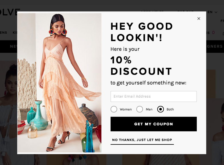
There are a few things I love about this entry popup:
- The salutation grabs the eye. Who doesn’t like being complimented like this?
- The image is large, high-res and showcases the product effectively
- The checkbox equivalent (women, men, both?) effectively segments this visitor. If they don’t complete a purchase in this session, we can add a javascript popup to appear the next time they arrive with a more targeted offer. See more on javascript popup below.
- The CTA button is large and value oriented (“Get” is always good).
- The exit option “No thanks, just let me shop” is clear, ensuring the popup doesn’t overly annoy visitors.
To make a popup like this one only display to first-time visitors, (you don’t want to give every customer a discount, do you?) use a third-party popup tool and set the popup display volume (how frequently the popup is seen) to once. This will make it so only first-time visitors see the popup.
Exit Popups
Exit, or exit-intent, popups are triggered by your site visitor attempting to leave a page of your website. They’re a last-ditch effort, and only appear when someone’s cursor moves over the top pixel of the page.
But, as they only appear when someone’s already made the decision to leave, they’re also the most controversial popup type. Sp it’s important to keep in mind a few things…
A few essential best practices when adding exit popups to your site:
- Only have your exit popups appear to visitors who have been on-page for more than 20 seconds. Similarly to scroll and timed popups below, time-on-page shows they’re at least a little interested in your offer.
- Make exiting the popup easy. Never hide the exit link or “X.”
- Make the popup’s offer clearly valuable. It can’t be random or unrelated to the page they were on, or they’ll be less than likely to return.
Example of Exit Popup Use Case:
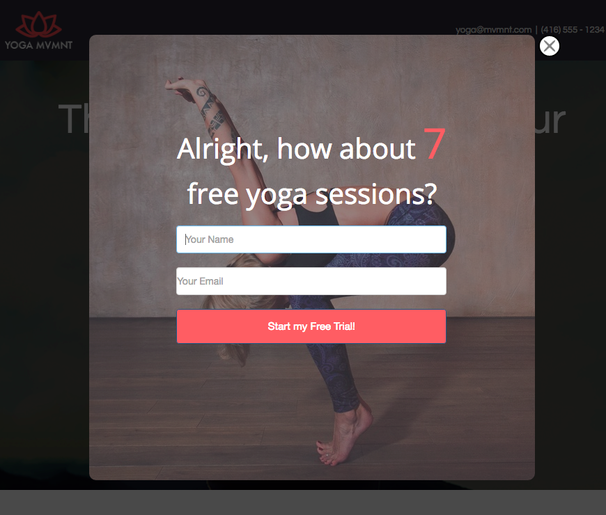
This would be an extremely effective exit popup on a yoga studio’s campaign page offering 5 free yoga sessions. Creating an exit popup which increases the page’s value proposition is always a good call.
Real World Example of Exit Popup Use Case from Wishpond:
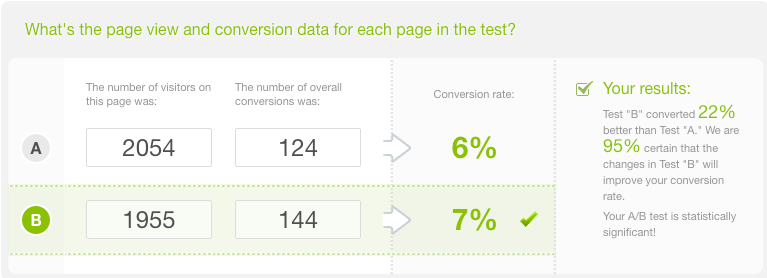
This exit popup has been added to Wishpond’s pricing page, and appears only when people exit the page. The strategy employed here is that of a lesser conversion ask. Essentially, we’ve said “It’s all right if you don’t want to buy now. Want to talk to someone to help make the right decision?”
It’s improved pricing page conversion rates by 22%:
Click Popups
Click popups are my personal favorite kind of popup. They’re completely non-invasive, and are triggered only when a page visitor clicks a call-to-action, like “Want to download this article as a PDF. Click here to get it free!”
Here’s a click popup in action to show what I’m talking about:
<iframe width=”420″ height=”315″ src=”https://www.youtube.com/embed/4blBEFCDZIY” frameborder=”0″ allowfullscreen></iframe>
Click popups mean that the visitor to your small business website isn’t sent to a new tab or page of your site. They can see something they want, click on it, and convert, all within one page.
We’ve recently tested click popups against landing pages on our blog. We have a lot of email-gated content which we promote on relevant articles. The link might just be “Want to download our complete guide to Facebook Ads? Click here.” Half of the people who click open a click popup, and half are sent to a separate landing page. Here are the results:
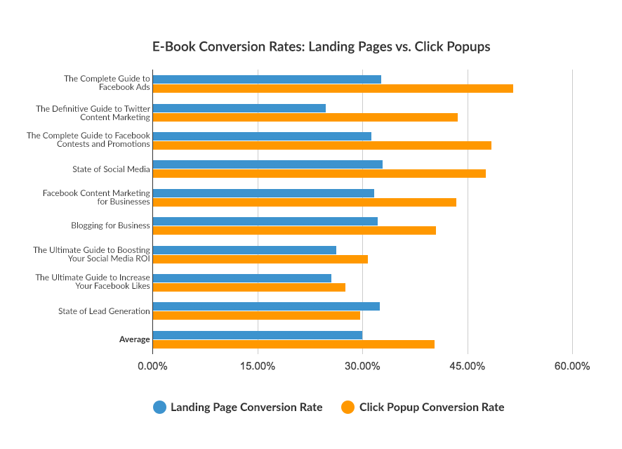
The 9 click popups we’ve tested converted, on average, at 40%. This is an average 35% increase from our landing pages promoting the same content.
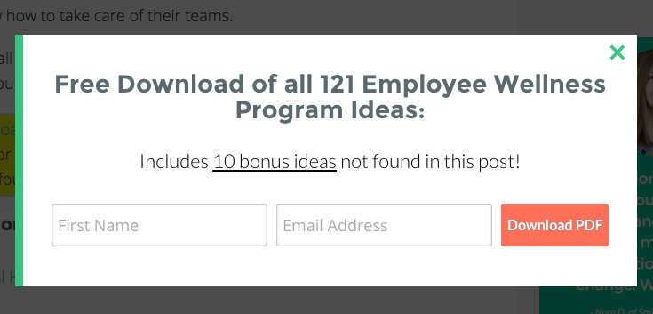
Real World Example of Click Popup Use Case from Snacknation:
Here’s the image link (within a blog article) which triggers the click popup’s appearance:

And here’s the click popup which appears:
Click popups are…
- Non-Invasive: They’re requested by the site visitor.
- In-page: Visitors can convert without leaving the page they’re on.
- Fast: Both to build and to convert upon, click popups are easy, small and simple.
Scroll & Timed Popups
Scroll and timed popups are behaviorally-triggered popups which appear after a certain period of time-on-page or a certain amount of page scrolled.
They work because they’re shown exclusively to people who have shown they’re interested in a page’s content.
They don’t appear to people to leave as soon as they arrive, and they don’t appear to people who just read the introduction of an article or a landing page and depart.
This improves conversion rates significantly.
Real World Example of Scroll Popup Use Case from The Blue Apron:
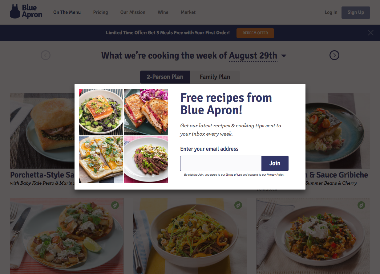
There are a few things I love about this timed popup:
- It’s completely relevant to the content on the page.
- Its formatting, design and colors align to the website’s.
- The submission field is large and simple, simply asking for an email address.
- The value proposition “Free recipes from Blue Apron!” is prominent.
- Attractive images of food increase the value of the free recipes.
Javascript Popups
Javascript-triggered popups are one of the coolest additions you can make to your website. And if the term “javascript” freaks you out, you’ll have to get over that.
They’re super easy to add, and here’s an example of why you’d want to:
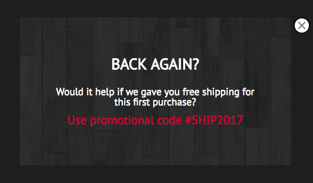
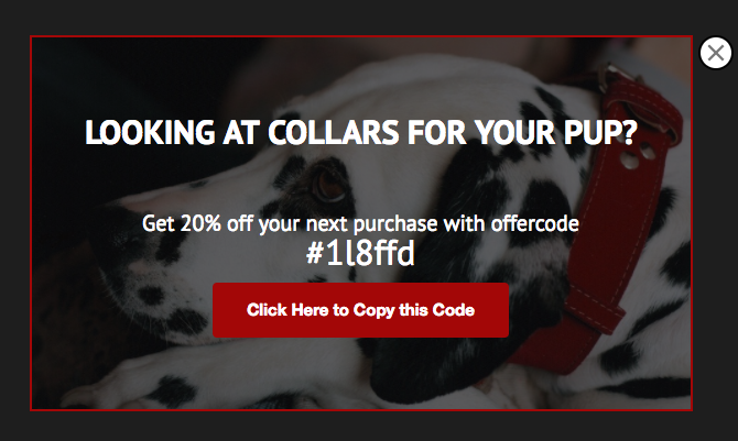
Imagine triggering this popup to show 5 seconds after someone arrives on your website. But not everybody, just people who have added something to your ecommerce shopping cart but didn’t checkout. Or people who looked at more than 5 product pages, but didn’t buy.
I’d bet you anything you like that it would improve conversion rates.
I was talking to my colleague about 5 seconds ago about this exact thing, and he mentioned that his wife loves to look at stuff online for their dog. The website she likes the most she’s already bought from, and if she’s looking at collars for too long she’ll get an email from them offering her a coupon code on dog collars.
She buys more often, I think, than he’d like.
A popup like the one above can be even more effective. It ensures your visitors see the promotional code you’re offering exclusively to them.
Real World Example and Javascript Popup Use Case from Efinancial:
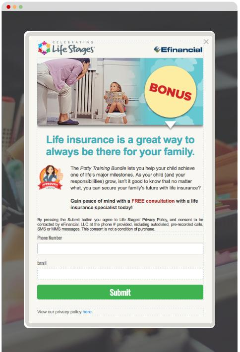
This popup is scripted to only show to Efinancial visitors and leads who have children – information gathered previously through lead generation or based on page visit.
Click here to learn how to add Javascript popups like the ones above to your site.
Small Business Popup Examples
Entry Popups Examples
https://wheat-sparrow-593571.hostingersite.com/wp-content/uploads/sites/3/2016/02/entry-popup.png
https://wheat-sparrow-593571.hostingersite.com/wp-content/uploads/sites/3/2016/05/entry-popup.png
https://wheat-sparrow-593571.hostingersite.com/wp-content/uploads/sites/3/2016/09/EntryShort-timed-Subscription-Popup.png
Exit Popups Examples
https://wheat-sparrow-593571.hostingersite.com/wp-content/uploads/sites/3/2016/09/Exit-Popup1.png
Click Popups Examples
https://wheat-sparrow-593571.hostingersite.com/wp-content/uploads/sites/3/2016/09/click-popup1.png
https://wheat-sparrow-593571.hostingersite.com/wp-content/uploads/sites/3/2016/09/Content-Upgrade-Click-Popup12.png
Scroll & Timed Popups Examples
https://wheat-sparrow-593571.hostingersite.com/wp-content/uploads/sites/3/2016/12/scroll-popup.png
Wrapping it Up
Hopefully this article has given you a better understanding of how you might add popups to your small business website.
They’re controversial, but they also work. They turn your website from a passive bystander, hoping visitors take the action you want, to an active participant in their decision.
They’re well worth a try, and adding them to your site is easier than you might think.
Stop standing behind the counter. Get out there and make the sale.
Related Reading:
- Should You Use Popups?
- 6 Real-World Popup Examples that are Absolutely Crushing It
- Why Popup Overlays are Taking Over Lead Generation
- How We Doubled Blog Lead Generation with Click Popups
- 5 Ways You Can Do More With Your Website Traffic
- 5 Exit Popups You Need to Know About
- How we Used Content Upgrades to Increase Email Opt-ins 16X
[/content-section]
[contentblock id=backtoindex]